Native App Development Case Study
Beach Bum
A Travel App Showcasing Some Of The Most Popular Tropical Beach Destinations In The United States
Goals
- Create an iOS travel app that targets millennials and gen-z populations
- Wireframe and prototype the app using Figma
- Translate design elements into a functional app using Xcode and Swift
Role
Lead Product Designer
Timeline
Fall 2022
Tools
Figma / Xcode / Swift
Platform
iOS
Research
The main purpose of the app is to discover beautiful beach destinations and be able to share your experiences and pictures with friends and family. While searching for inspiration, I noticed how there were no apps concentrated on this aspect of travel with the mix of social media besides big-name companies such as Tripadvisor which incorporated additional travel aspects such as hotels, rentals, etc. Therefore, I wanted to create an app that focused solely on beaches and allow people to create posts about their trip while encouraging them to visit new ones.
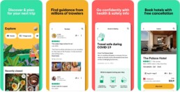
While brainstorming ideas for the types of features to include in the app, I wanted to appeal more to the Millennial and Gen-Z populations by using social media elements that allowed for more interaction within the app with friends/family. I referenced Twitter, Instagram, and an app called Untappd, a social media app for beer/breweries that allows you to “check-in”, rate it, and share with friends.

Moreover, To create the most efficient and enjoyable user experience possible, I organized the mapping and layout by common mental models to reflect other apps by the use of a large navigation bar with 4 main features (Home, Map, Notifications, and Profile) and clutter-free, scrollable screens. I also tried to make the layout the most aesthetically pleasing as possible by the aesthetic usability effect in hopes of better influencing the user’s perception.
Design
Low-Fidelity Wireframe
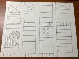
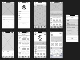
After brainstorming and sketching ideas for the layout of the app, I finalized the mainframes and began the placement of the components.
- Created 8 frames (Login, Sign up, Homepage, Main Feature, Map, Notifications, Profile, and Settings)
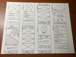
After finalizing the layout, I started to include placeholders and labels for the various elements.
- Labeled form elements (i.e., Username, Password, Email, etc.)
- Labeled tab bar elements (Home, Map, Notifications, and Profile)
Medium-Fidelity Prototype
After translating my Paper prototype to Figma, I began to visualize the features and elements that would be included in the app. I put in text/content fillers and finalized the layout and button placement.
One of the changes from the original paper prototype is the addition of the last frame. While translating, I realized that I forgot to include the”post” frame where the user would create their posts. So I drew up the frame and included it in my Figma prototype. Additionally, I made slight changes to the navigation frame and took out the location search bar at the top of the screen, and decided to just keep the search bar about three-quarters down, above the navigation button. This made the screen less cluttered and emphasized the map. And on the profile frame, I included a “photos” section that the user could tap that shows all their photos from their posts instead of attached to each post for easier accessibility.
I’m particularly proud of the overall layout and look of the panel. Before learning how to use Figma, I was hesitant about my ability to navigate the software and create a prototype. But after watching the videos and practicing with this project, I can confidently say that I know how to operate it.
High-Fidelity Prototype
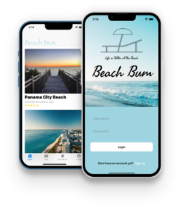
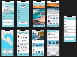
The major change in this phase was the addition of actual images and content to make the prototype a high-fidelity MVP. I included the app name/graphic, original photos, example text, color, and typography to make the prototype as realistic as possible. After doing this, I was very pleased with how the prototype turned out.
From this stage, it was quite easy to go from my medium-fidelity to high-fidelity prototype. I just substituted all containers and text holders with example content. I also included some of my past photos at the beach in place of the containers where the users’ pictures would be. That being said, I didn’t face any challenges or issues while working on this panel.
From a designer’s perspective, I wanted to keep consistent colors and typography throughout the app with white and light blue colors. I added seaweed script font for the main headers that reflected the beach aesthetic of the app but kept the SF Pro Text font for the main content text for accessibility reasons. I also really like the homepage and the layout of the main content. I wanted to make the main frame very clean and organized so I listed the containers vertically so that the user can scroll down to view relevant beaches.
Other than adding connections to the different frames that made the prototype flow with interaction with the various buttons, the element that I am most proud of is the interactive map plugin I used for the map frame. Prior to googling how to include a map, I didn’t know about the available plugins in Figma and was surprised at how many options there were. For this element, in theory, if a user wanted to search how to get to the desired beach, they could enter the name, city, state, or zip code and be redirected to Apple/Google maps.
Development
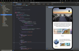
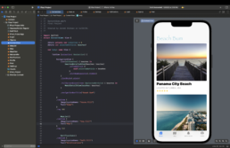
Although not knowing how to implement some of the original design elements into the app, I utilized my knowledge of Xcode and Swift to create an app that resembled the original prototype to the best of my ability, while incorporating some new elements learned over the course that enhanced the app.
For example, I created a card view for each beach on the homepage that, when pressed, triggers a modal view that displays the information and posts for each beach. This change made the homepage look more modern and minimal which millennials and Gen-Zers look for when navigating an app.
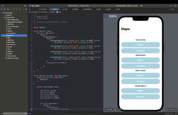
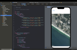
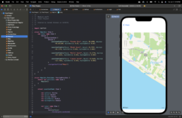
Another aspect that changed was the navigation tab. Originally, I had it so a user could utilize the search bar to look up beaches around the United States and get directions. However, I didn’t see this as feasible for this project so I included buttons for satellite and standard map views of each respected beach to show an aerial flyover view of the beach as well as landmarks, restaurants, and other places of interest.
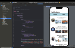
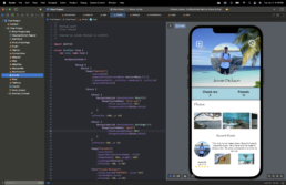
However, there were some parts of the app that I was able to copy from the original prototype. One was the notification page, which displays friend activities and posts, in addition to, events at the beaches such as music festivals to encourage you to attend. I was also able to recreate the profile page with all the original elements (post and setting icon buttons, photo gallery, and recent post component).
Results
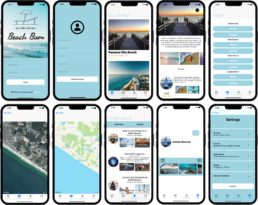
The main lesson I learned from this project and completing the whole design cycle from a low-fidelity paper prototype to a functional iOS app is that your view of the product can change throughout and you have to trust the process. Your original idea for the app might not end up being what you anticipated it to be but that shouldn’t discourage you. In fact, it makes designing even more entertaining because you have the freedom to go in any direction you wish. So although my final project didn’t identically resemble my Figma prototype, it doesn’t make it any less but actually enhances it by the use of new elements that I didn’t know were possible when I first created the prototypes. In the future, I hope to learn more to further this project and hopefully make it functional between different accounts. But overall, I am really proud of how this project turned out and satisfied with the progress I’ve made over the course of the semester.