User Experience Strategy Case Study
Visit Athens
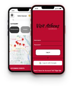
Visit Athens facilitates a quick and easy way to navigate around Athens, Georgia. Users can research restaurants, find nearby music events, and book accommodations.
Goals
- Create a mobile app version of the Visit Athens website featuring some of Athens, GA’s main attractions and events.
- Use Figma to design and prototype the app
- Conduct usability tests and tasks on real users to measure functionality
- Collect qualitative and quantitative data to inform future design iterations.
Role
Lead UX Designer / Researcher
Timeline
July 2022
Tools
Figma
Platform
iOS
Project Summary
As a product designer hired by the Athens Clarke-County Convention and Visitors Bureau, my goal was to create a mobile app dedicated to exploring Athens, Georgia. The project objective was to ideate solutions to common problems with the web-based site and create a high-fidelity mobile prototype using Figma that enhanced the user experience. This meant restructuring the information architecture to a responsive format and improving usability through user testing and research.
Target Audience:
- Individuals aged 18-34 years old
- Athens visitors
- UGA students
- Social media users
App/website inspiration:
- Yelp
- Expedia
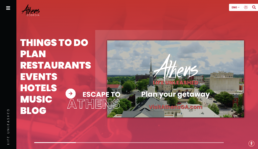
- Athens Clarke-County Convention and Visitors Bureau Website
Challenge
- Our task was to create a replicative mobile app based on the Athens Clarke-County Convention and Visitors Bureau website dedicated to exploring Athens, Georgia. With the various different activities, our focus was to include as many categories and examples as to resemble a real MVP.
- We used Yelp and Expedia as our inspiration, which had the advantage of learning their design layouts and flows but it also limited our ideas. So our struggles included how to go beyond their template and make the prototype more creative and fit our theme. The Figma prototype design and mapping were also difficult due to the many features and amount of content of the app.
Solution
Low-Fidelity Wireframe
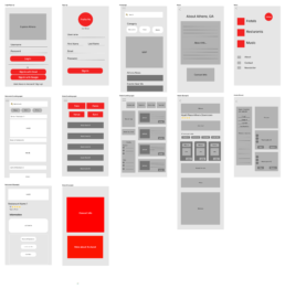
My team began by creating a low-fidelity wireframe using FigJam to brainstorm the main features and components of the app. This included grouping content and information within appropriate frames. We started with the main login and sign-up screens users would interact with when first opening the app. We wanted these pages to be as simple and straightforward as possible to ensure that the user would have no trouble accessing the app. We also included the “Sign-in with Google” widget that most apps now have for a seamless process for creating an account.
Moreover, instead of including all of the categories on the website, we chose to focus on three: Restaurants, Hotels, and Music. We saw these as essential when visiting Athens hence being a good starting point for our initial design. We further divided up the three categories/pages into smaller subcategories/subpages that featured specific information about each item and components related to those categories.
High-Fidelity Wireframe
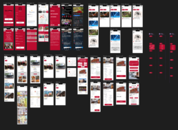
Once finalized, we translated our designs to Figma to create a high-fidelity MVP. This was the most time-consuming part of the design process; creating the interactive components and features of the app. The final product includes 38 frames with various content.
To address the issue of a large amount of content, I created a sort overlay component that once pressed, displays a dropdown menu that filters the content based on the sort. This allows for easier access to the user’s desired information in a more convenient way.
Main Frames
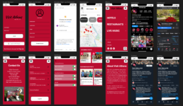
These are the essential frames of the app. It includes the Login screen, Sign-up screen, Google sign-up extension, Homepage, Menu page, Contact page, Settings page, and About page.
The Homepage is the main feature of the entire app. It serves as the place where users go to find the information they need. It includes a personalized welcome message, search bar, and hamburger menu that can be accessed to access the About and Contact pages, Settings, and Visit Athens’ various social media accounts. Under the search bar, there are buttons for the three categories that can be quickly identified and utilized upon entering the app. Next, is a map of Athens that pinpoints recommended restaurants, hotels, and music events near you. And lastly, we included an “Upcoming Events” and “Featured Blog Posts” section that highlights some of the upcoming events and posts about the surrounding Athens area. I organized these in a horizontal scroll view so the user can swipe left and right to view the content.
Music Frames
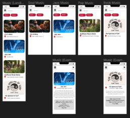
These are the music frames. It includes a landing page where users would be directed once pressing the “Music” option in the menu categories. It currently has four example card views that feature upcoming music events with the artist/band name and venue location. And at the top of the page, there is a search bar that users can utilize if looking for a specific artist/band and two dropdown navigation components that function to sort the results depending on genre and venue.
Moreover, I included two example frames that take the user to a more detailed view of the artist/band of choice that features the venue address, brief description of the band/artist, date, time, and price of admission.
Restaurant Frames
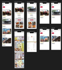
These are the Restaurant frames. It is structured very similarly to the music frames for layout consistency throughout the app. It features four popular restaurants around downtown Athens. I also included a search bar and sort component so users can more easily filter the content to their desire. And like the music frames, once a user clicks the card view, they are taken to a detailed view where they can find more detailed information about each restaurant including star review, location, and hours of operation. Additionally, I included a button that takes the user to the food menu so they can see the food options that each restaurant provides.
Hotel Frames
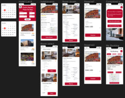
These are the hotel frames. It includes a landing page that displays form fields for Check-in, Check-out, Guests, and Night inputs to show hotel availability based on those requirements. It also features some of the most popular hotels in downtown Athens.
Moreover, I included an example user flow that shows how the user would navigate through this portion of the app. Once the user clicks a hotel, they are taken to a page that contains detailed information about the hotel and included amenities. If the user wishes to proceed with reserving a room in this hotel, they would be taken to a page with different room options with information. They would then proceed to select the specific type of room and complete the reservation. Lastly, once the reservation is completed, the confirmation information can be accessed through the “My booking” page.
Usability Tests and Tasks
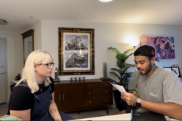
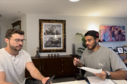
After completing our high-fidelity MVP, we conducted usability testing with eight participants to examine the functionality of the app and areas of improvement. For our testing methods, we used in-depth interviews for our preliminary test and product reaction cards as our post-test method. We also created ten tasks in total to determine the usability of the app. The first five were common functionality tasks to assess the success or failure rates of example scenarios and the last five were time tasks to assess how fast the users could complete the task at hand.
Testing Methods
Preliminary Testing method: In-depth interview during the testing session
- Are you a UGA student?
- How long have you lived in Athens?
- What mobile devices and/or tablets do you prefer using?
- What do you use your mobile device(s) for most consistently?
- What is your favorite app?
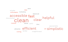
Post-testing methods: Product Reaction Cards
- Pick five characteristics that best describe the app and explain why.
Tasks
Common functionality (Success/Failure) Tasks
- Your friends are coming to visit Athens from out of town and you want to help create the perfect itinerary for the weekend. Open the Visit Athens app and create an account using Google.
- Your friends really love music. Since there’s a game on Saturday, you want to take them to a show on their first night. Find a jazz show to take them to.
- To give the most immersive experience, you want everyone to stay together downtown. Can you book a room with two beds at the Hyatt?
- The Dawgs have a football game that weekend at 4:00 pm. You want to show your friends your favorite restaurant, which is near your favorite tailgate spot. Find out if Cali-N-Tito’s will be open before the game for lunch.
- You want to tag the app in your social media posts on the weekend. What hashtags do they suggest on their Instagram page?
Time on Tasks
- Your Mom loves Italian and wants to see the town soon. Can you find the menu at DePalma’s?
- Athens is full of breweries and your friends love music. Are there any shows coming up at a brewery?
- You want to learn more about the Bureau. Is it a 501 entity?
- Change your notifications to only emails from the app.
- You love social media. Follow the Bureau’s Twitter account to stay up to date on Athens happenings.
Results
Quantitative Results
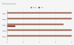
After our usability testing, my team conducted data analysis that produced quantitative and qualitative results. Our findings suggested that the app was generally easy to navigate and almost every test user was able to quickly complete tasks in a timely manner. Due to the high success rates in phase one, there seem to be no major issues so far. Minor issues experienced included clickability in a few cases, misunderstanding of the layout, and confusion on the test tasks themselves.
Success Rates
- Task 1 – 70-100%
- Task 2 – 70-100%
- Task 3 – 50-99%
- Task 4 – 70-100%
- Task 5 – 70-100%
*Calculated at a 95% Confidence Interval
Task Time
- Task 1 – Mean: 11.69 / Median: 13
- Task 2 – Mean: 14.20 / Median: 15
- Task 3 – Mean: 14.82 / Median: 20
- Task 4 – Mean: 17.08 / Median: 17
- Task 5 – Mean: 7.48 / Median: 8.5
*Calculated at a 95% Confidence Interval
Qualitative Results
Usability Findings
- The test users found it generally easy to navigate through the application. Most were able to quickly complete tasks and commented on the easy navigation. To quote one user, “it was super easy to navigate.”
- Design elements are simple and clear, while attractive and accessible. The colors and graphics were complimented for representing the area while also maintaining a more basic layout, mostly preventing confusion by the user.
- The purpose of the app is appreciated and considered valuable to visitors of Athens. One user stated “it makes me want to book a room now” while testing.
Errors
- Due to high task success in phase 1 testing, there seem to be no major issues so far.
- Minor issues experienced included clickability in a few cases, misunderstanding of the layout, and confusion on the test tasks themselves. There were a few instances of the hamburger menu not being the home button, so that’s something to consider in future development.
Design Recommendations
- Expand the hotel search options before the next round of testing to ensure all search options are functional. Also, adjust text sizing for more accessibility. This should limit confusion when attempting to book a room.
- Adjust the about section to include more or better information about why the Bureau wanted the app, and to explain why it exists. It can be unclear to users who owns the app and why that organization feels it is valuable. Also, adjust the typography to create a more cohesive page.
- Improve filtering, especially on restaurants and music pages, to prevent usage lags and confusion for the user. This will make for a more enjoyable experience while increasing exposure for additional businesses.
Reflection
As the final project of the class, we integrated all of our knowledge acquired from the previous chapters and modules into creating a functioning app that features some of the many attractions in Athens, GA. Our team followed the complete design process of sketching the wireframe to testing the app on target users while also becoming proficient using Figma. We also learned to use components, plugins, and widgets to make the prototype’s flow better and more interactive for the user.
After completing this project, I am confident in my project management and UX design skills for the development of future app prototypes that holds the user in mind throughout the whole human-centered design process.
UX methodology
In this project, we used:
- –Jakob’s law: Our restaurant and hotel parts work in the same way as Yelp and Expedia to reflect consistency.
- –Law of uniform connectedness: For components with similar functions, we designed them in the same format.
- –We require users to rely on their experiential cognition when they are using our app. So we have designed the app to be simple and easy to use to reduce users’ cognitive effort.
New skills acquired:
This final project is an integration of everything I have learned over the course of this class and experienced the complete design process from sketching out ideas to developing a functioning prototype. I have also become more proficient in the use of Figma and learned to use some components that made the prototype more interactive and flow better. Additionally, as lead designer, I learned how to manage a team and delegate work based on a person’s interests and abilities.
Struggles faced:
The main struggle I experienced while working on this project is the amount of work and detail that went into the final product. With this being the first app that I designed and prototyped from start to finish, I didn’t realize the amount of work that was involved in making an app. Moreover, while I learned how to manage my team, it was also difficult in communicating with everyone and coming to a consensus on certain design aspects.
Things you’re proud of:
I am most proud of the final result of this project. Before this class, I had limited knowledge in the field of user experience and did not know how to use Figma but through experience have become proficient in creating any prototype I desired. And with the UX industry moving towards using Figma, I am glad I got a chance to learn it before entering the real world of digital design.
Moreover, I am proud of the amazing work that my team and myself have produced over the two weeks of working together. Being that the class was taught online and asynchronously, we had never interacted before the start of this project but worked together to create an app that I could see being in the app store. Therefore, I am proud of the work we have produced and the hard work everyone put in.